
Analytics graphs have many operational features to help clarify and compare data.
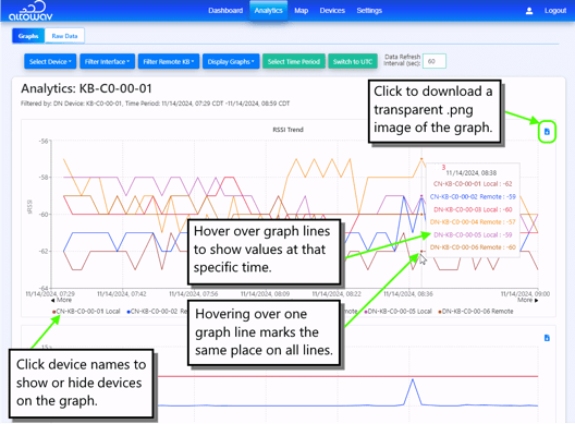
What the names in the legend tell you: The color key below the graphs lists the name of the device on the remote end of the link, (to identify which link each line shows). The name is followed by the word Local or Remote (to specify which end of the link reported the data). For example, KB-XX-XX-XX Local graphs data from local side of the link between the selected device and KB-XX-XX-XX. KB-XX-XX-XX Remote graphs data for the same link, from the remote side of the link.
Additional operational tips
- Click on the < More > at either end of the graph to expand the timeline in either direction.
- Expand a time period shown in the graphs by clicking and release to select a time period. Click and drag along the x axis, then release to select the time period and to expand the graph to that time.